History

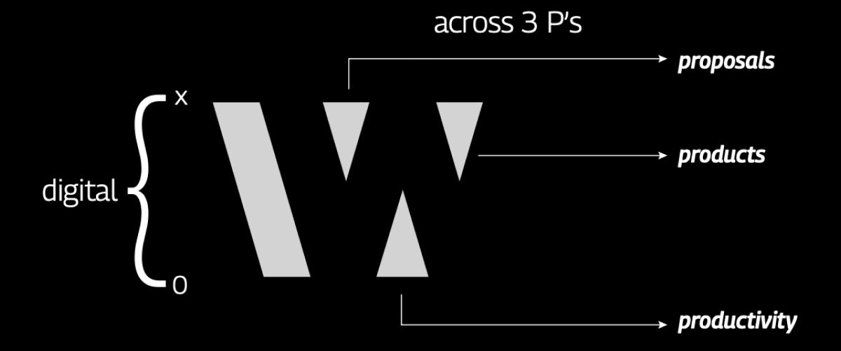
Bids and Beyond Consulting, founded in 2016 with the idea of helping companies in bids/tenders/RFPs with end to end proposal support to save their time and help them win more as a bid consulting firm. Gradually, we evolved ourselves as a growth consulting firm, where support is not limited to bids/proposals but also to other levers of growth. Eventually, we turned into a digital growth consulting firm to prepare global businesses win more through digital innovation across proposals, products, and productivity.

The Brand

worxwide sounds worldwide as well as world wide web. X denotes digital experience and multiplication factor, reflecting a global growth firm.

A digital growth consulting firm.
Anatomy

Concept

The 3 triangular elements together with the slanting slash forms an abstract W. The Three triangular elements representing 3 core processes cuts a channel between them, leading to the formation of second W in the negative space. The idea is to present how different strategies work at the background to ensure a smoother process at the forefront. The second W as depicted also represents a growth curve that has deliberate flat ends at the top and bottom so as to show the ‘width’, strategies are set for the progression to continue forth.

Brand Colors
Primary #FF9900

Orange.Worx

Playfulness
Enthusiasm
Friendliness
Confidence

Secondary #165F75

Blue.Worx

Professional
Secure
Trustworthy
Tranquility

Secondary #999999

Grey.Worx

Practical
Efficiency
Timeless
Classic

Secondary #000000

Black.Worx

Power
Intelligence
Modern
Respectability

Wordmark

The brand’s wordmark is set in Helvetica Neue Condensed Black font, which combines clarity, simplicity and neutrality along with added legibility and flexibility. The wordmark appears bold and upright when dressed in the selected font, giving it a character the brand owns.

Elements from Wordmark

The worxwide identity is completed by the logo and the wordmark together. The significance of the wordmark is highlighted by the letter X within the brand name. identity

This X denotes digital experience and multiplication factor, reflecting a global growth firm.

This X is composed of two arrow elements, coinciding with each other. The forward arrow element is treated as primary elements and the opposing arrow is considered secondary, overlapped by the primary arrow.

Value Palette

to clients and our people for their growth

by everyone, for everyone. Respect all and stand by the word

to society when and where it matters

driven culture; add more value to our people and clients

What can we help you with?

    Our Global Presence
    Lewisville
    tx, USA
    Ruislip
    London, UK
    Gurugram, Bangalore, Mumbai
    India