Introduction: Significance of Data Design and Data Visualization
It is imperative to understand your digital product entirely, especially when offering UX design services, whether involving its strengths or weaknesses. However, it is essential to identify the key areas for improvement to enhance the platform and make it more user-intuitive.
You can draw multiple inferences with the help of data, such as users abandoning the website from a particular page or the drop-offs from the application in a short span of time, along with high bounce rates. However, figuring these factors out is not always indicative of an issue since there is a possibility that users drop off from a particular page because they have completed their task. Hence, it’s essential to dive deep into the data gathered to come to a conclusive inference.
Data visualization plays a vital role in drawing conclusions since it is a graphic representation of information or data. It is a very useful strategy for showcasing various types of learners since approximately 65% of people are visual learners. There are multiple data visualization tools, such as charts, graphs, and maps, that let you provide a roadmap to present information visually to people, which is more eye-catching than otherwise. This helps in understanding certain trends or patterns which may be beneficial to understand for strategizing the business trajectory. It becomes facile to captivate your audience by presenting visual data to your stakeholders.
Data visualization has a few more specialties, such as:
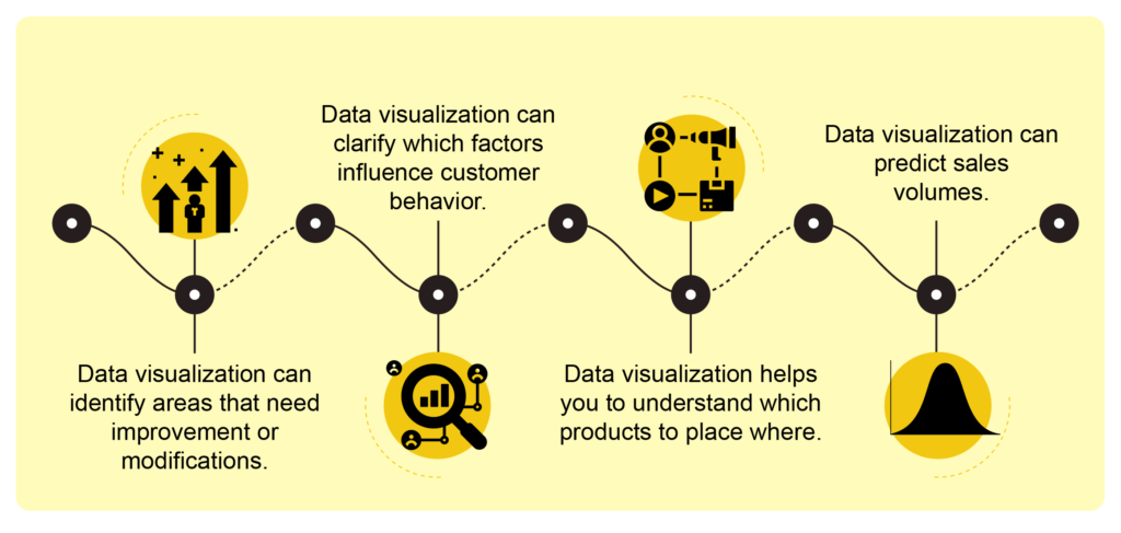
Data visualization tools have been necessary for democratizing data and analytics and making data-driven perception available to workers throughout an organization. They are easy to operate compared to earlier versions of BI software or traditional statistical analysis software. This guide to a rise in lines of business implementing data visualization tools independently, without IT support.
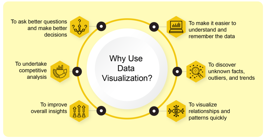
Visualizing data is one of the most effective strategies for getting the numbers out there and translating them into conversions, especially when offering UX design services. There are multiple UX Research methods that liver effective results, such as surveys, interviews, A/B Testing, First Click Interaction Testing, Competitive Analysis, and Heuristic analysis. While collecting the required data isn’t the most challenging part, it is being patient while analyzing the data. Working with the data requires fundamental understanding, and staying patient is crucial to achieving positive results.
A well-designed dashboard goes a long way when launching a platform. Dashboards are a visual representation that consists of some of the most important functionalities/objectives. They are consolidated in one single screen so that the required information can be viewed briefly and reduce the effort on the user’s end. Dashboards are a powerful way to present data-based intelligence using data visualization techniques. Utilizing the right approach to data visualization techniques is a key feature in ensuring the successful foundation of the dashboard. The objective is to simplify the complex data in a comprehensible visual representation for stakeholders to understand and infer from.
A Power BI dashboard, usually known as Canvas, is a single page well-designed to contain the most important highlights of the story, making it much easier to view data reports with detail, visualization being the key here.
However, having a great dashboard is not inclusive of only detailed visuals but also the functionality should be optimal. There are multiple user requirements on the dashboard; one is to view the highlights, and the second is to carry out the functionalities smoothly.
Power BI dashboards are very convenient for revealing key insights consistently, which could easily be lost in data sheets. Multiple organizations use it to make informed decisions faster, and the good news is that you don’t have to be an IT expert to create one using Power BI.
Before proceeding with the dashboard, it is imperative to decide what information will be highlighted instead of others. For instance, a sales-based firm will contain information related to the total revenue of the company, invoice, conversion rates, total sales region-wise, and multiple other sales factors which is important to the organization. The dashboard will contain all these factors with respect to sales because this is what the company will be concerned with.
The dashboard will be highly personalized from company to company based on their goals and objectives along with their approach. The visualizations within the dashboard are referred to as ’tiles.’ You pin tiles to a dashboard taken from reports. Data plays a vital role in creating dashboards using Power BI because the visualizations part of the dashboard is extracted from datasets, so in essence, these are data-driven designs.
Before going any further, let us first understand what Power BI actually is.
What is Power BI?
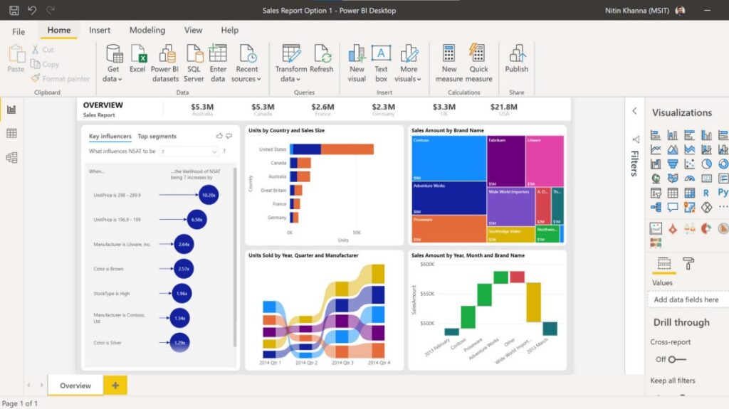
Image via Microsoft.
When it comes to data, the quicker you can put together all the pieces into one cohesive whole, the quicker you can comprehend it and apply it to better your organization. With Microsoft Power BI, you can easily connect to data, prepare it, model it, and visualize it any way you wish. You can then share insights in a secure manner and even embed them in your app or website.
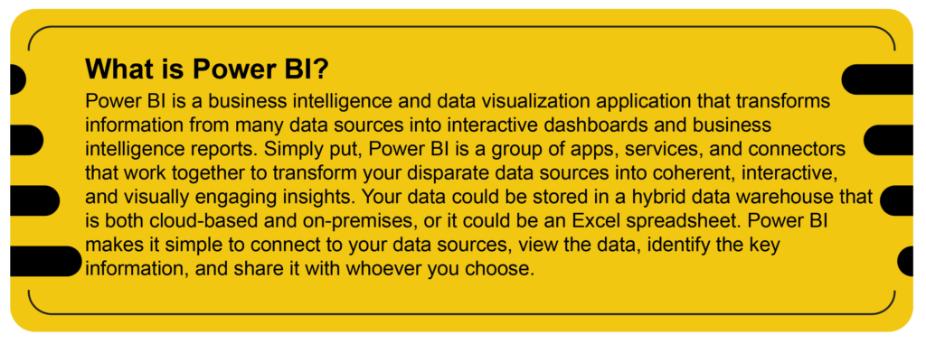
Power BI is a product of Microsoft and was launched in 2013. It is a business intelligence and data visualization tool to get the story behind the data via eye-catching visualizations. Of course, Power BI is not only limited to use for visualizations. But we can transform, manipulate, and do other tremendous things using this. The Power BI desktop, Power BI SaaS service, and mobile Power BI apps that are compatible with many platforms are all included in this business intelligence suite. Business users use these services to consume data and build BI reports.
Power BI Versions
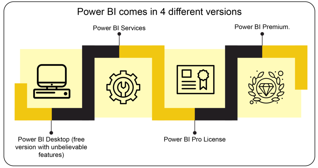
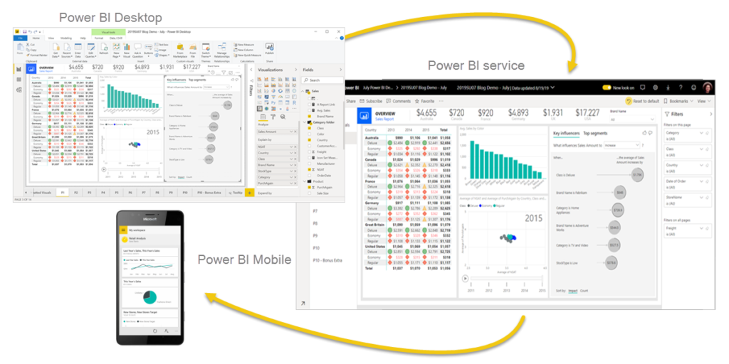
The Power BI desktop app is used to create reports; Power BI Saas (Software as a Service) is used to publish these reports; & Power BI mobile app is used to view these reports and dashboards.
You may generate, distribute, and use business insights using these three components (Power BI Desktop, Service, and Mobile Apps) in the most efficient manner for you and your position.
Beyond these three, Power BI also features two other elements:
- Power BI Report Builder – Paginated reports can be made using the Power BI Report Builder and shared using the Power BI service.
- Power BI Report Server – After developing your Power BI reports in Power BI Desktop, you may publish them on the on-premises Power BI Report Server.
Download the free Power BI desktop program and launch it right away to begin going. You’ll soon be able to acquire real-time information and transform that data into dynamic live graphics by connecting to hundreds of data sources, both on-premises and in the cloud, including Excel, Salesforce, Google Analytics, social networks, and even IoT devices.
Upgrade to pro after you have that down. You’ll need it to start working together freely, build dashboards that give users a 360-degree view of your company in real-time, manage who has access to and uses your data and package and distribute your gorgeous new content through user-created apps.
The premium version is for really scaling up across larger enterprises and embedding content past your digital properties without per-user licenses.
One more thing: Do you want it all on your mobile so that you can react to changes on the fly? Well, here you go. With Power BI, you can always comply too for things like GDPR. Download the free Power BI application today and start turning your data into more intelligent decisions for your business.
Why Power BI?
You’ve probably heard about MS Power BI – it’s the trending buzzword nowadays; everybody seems to be talking about it and wanting to use it. At the same time, many people are asking, ‘why don’t I keep using Excel?’ ‘What’s so special about Power BI?’ Let’s find out.
Power BI does sound very technical, but actually, it’s not. It’s a self-service business intelligence, which means that you can produce some great-looking visual reports. We don’t have to wade through dull, dry numbers all the time. If you’re a person who must make those reports for management, you can use Power BI. Suppose you’re making decisions from these reports. In that case, you will be able to interactively play with those reports, click on different parts of them, and gain greater insight into your results. So, Power BI lets you pull data from multiple sources. You can pull it in from SAP, Oracle, any data warehouse, an excel file, or a website. There are several different sources that you can pull it from.
When you bring that data in, it’s probably going to need a bit of cleaning up, and I bet that more than a few of you have spent a lot of your time going in getting rid of columns, replacing and finding stuff, making it just look a lot better so that you can make a decent report. The best news is we have this beautiful tool in Power BI called the ‘query edit up,’ and what you can do with that is clean it up just once.
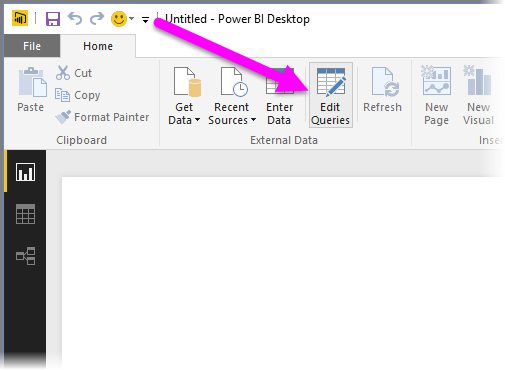
Query Edit Up in Power BI. Image via Power BI Desktop.
Next month or next week, when you have to do it all over again, you simply bring the data in, it’s magically kept all your steps, and you’re ready to go—a massive time saver. So, once you’ve got this data model, you can start creating what we call ‘reports’ and ‘dashboards.’ Now, these contain visualizations. These are the next generation of graphs that you are probably familiar with from Excel. Now the beauty of these is that they are interactive; you can touch them, you can play with them, you can see other graphs changing as you do that, and what makes it even better is that you can look at them on different devices. You can avoid staring at a screen at your desk. You can look at it on your phone or tablet, and everybody in the meeting can open it up.
If you’re worried that you must be technically minded to use Power BI, if you’re worried that you must know a lot about Excel, that’s not necessary. So, you’re ahead of the game if you have a background in Excel. Excel has had charts in it for a very long time, but this starts a little bit dated, and many users have found that they need help getting the graph they want.
One of Power BI’s most impressive features is its artificial intelligence. You’ve been slaving away, making all these fantastic-looking visualizations, but one of the great things is you can click a button to analyze your data for you and produce a bunch of different graphs. You could look at one of them and say hey, that’s even better than what I could think of. So quick insights are something that you might want to employ to get the right answer to the story you’re trying.
Steps to Set up Power BI
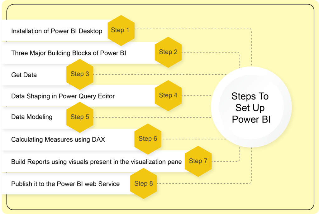
A data visualization tool like no other, Microsoft Power BI offers advanced analytics that lets users create useful information from data to address business issues. Let’s attempt to comprehend the core ideas behind Power BI.
This section will cover the fundamentals of loading data from diverse sources, data transformation, modeling, and data visualization. The steps for utilizing Microsoft Power BI to visualize the data are listed below in brief:
Step 1 – Installation of Power BI Desktop
As the initial step, you need to install the Power BI app on your desktop. Click on the link and download the free Power BI Desktop app.
Step 2 – Three Major Building Blocks of Power BI
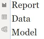
Report-Create Visualizations, Data-Data loaded from different sources, Model-Show relationship between tables
Step 3 – Get Data
Import data from different Data Sources ranging from fundamental excel files to online services like Microsoft Dataverse.
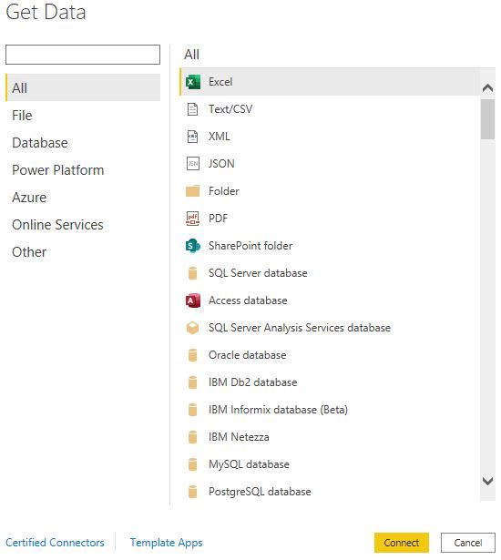
Power BI Data Sources
Step 4 – Data Shaping in Power Query Editor
After fetching data from the respective data sources, we need to transform the data by implementing the following steps in the power query editor according to the requirements collected:
- Data Cleaning – Deleting unnecessary columns and rows
- Data Naming – Assigning a correct name to the columns or tables
- Data Formatting – Creating custom columns and performing string operations such as uppercase, lowercase, and split
- Data Reformatting (into data types) – Changing text as numbers and vice versa
- Data Combining – Occasionally, single data sources are insufficient to meet the specified requirements. So, in such cases, we need to merge and append queries from separate unrelated data sources.
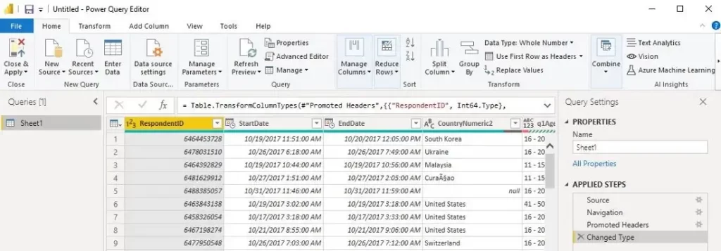
Power Query Editor in Power BI. Image via Power BI Desktop
Step 5 – Data Modeling
The relationship between the tables is automatically determined by Power BI and shown in the ‘Model and Relationship’ view. However, since successful data modeling results in straightforward and rapid data analysis, we may need to show the relationship between the tables in the Model and Relationship section after data transformation.
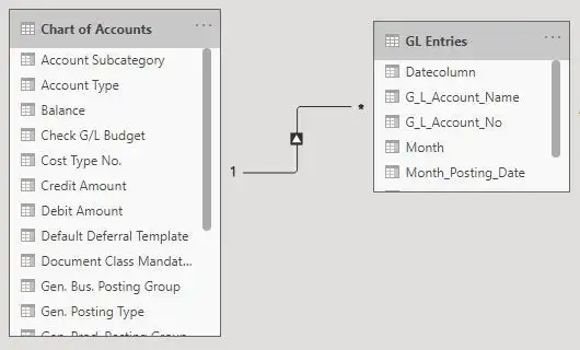
Model and Relationship Section in Power BI (One to Many Relationship)
Step 6 – Calculating Measures using DAX
Measures, calculated columns, and calculated tables all use DAX formulas for advanced calculations. The necessary KPI metrics must be calculated from raw data using DAX(Data Analysis Expressions).


Images via Power BI Desktop
Step 7 – Build Reports using Visuals Present in the Visualization Pane
Power BI offers many customizable charts, tables, graphs, and maps for visualization in the visualization pane. Select the visuals you’ll need for the report, then the fields you’d like to illustrate. Add Power BI slicers to drill down the data to make your report more flexible.
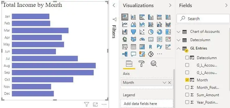
Visualization using Stacked Bar Chart. Image via Power BI Desktop
Step 8 – Publish it to the Power BI Web Service
After completing the report, click on the “Publish” button so that the report will get to the Power BI account, where you can share it via email or a connection.
How Does Power BI Match Your Role?
How you use Power BI may vary depending on your position within a team or project. Power BI may be used differently by others in different jobs. For instance, you might utilize the Power BI service solely to examine reports and dashboards. Your teammate may use Power BI Desktop or Power BI Report Builder to generate business reports, which are then published to the Power BI service, where you may access them. Another sales associate might primarily use the Power BI mobile app to check on the status of their sales targets and to delve down into the specifics of fresh leads.
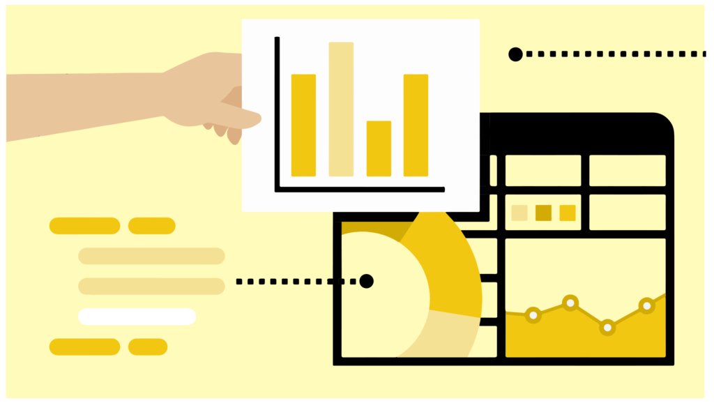
Developers can incorporate dashboards and reports into their own unique applications or push data into datasets using Power BI APIs. Have a suggestion for a fresh visual? Build it on your own and distribute it to others.
Depending on what you’re attempting to accomplish or your position within a particular project, you might employ each Power BI component at different times.
Which Power BI feature or service is the ideal tool for your situation can influence how you utilize Power BI. For instance, you may use Power BI Desktop to make reports for your team on data on customer engagement, and you can use the Power BI service to view inventory and manufacturing progress in real-time dashboards. Based on a Power BI dataset, you may produce a paginated report of mailable bills. You get access to every Power BI feature, making it so versatile and alluring.
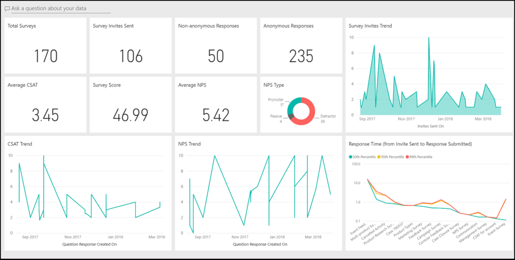
Customer Engagement. Image via Power BI Desktop
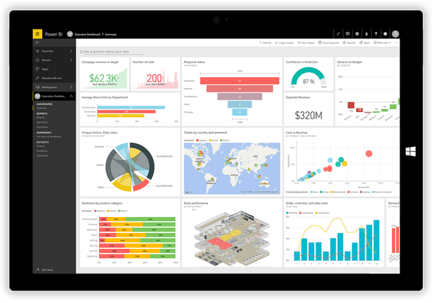
Inventory Management. Image via Power BI Desktop
How Worxwide Can Help You Design Data
Worxwide Consulting a leading digital growth consulting firm, enables businesses through innovative solutions and new-age thinking. Our core competencies lie in Bid Management, Sales Transformation, Customer Experience, and User Experience services. With our bases in the US, UK, and India, we serve a broad spectrum of industries including Manufacturing, EdTech, Healthcare, Tech & Telecom and Fintech. We are committed to being your trusted partner in navigating the complexities of the digital landscape, enabling you to secure more business opportunities.
Get in touch with us today.
tx, USA

London, UK

India


