
Introduction to Design System
A Design System is usually defined as a set of standards that help manage a design at scale by creating a shared language along with visual consistency across different channels/pages while reducing redundancy overall.
Why Use a Design System?
UI/UX design services have evolved at an extremely rapid pace over the years, and with that, the demand for UI screens has also increased multifold. There are millions of websites/apps and further billions of pages/screens under them available on the internet. With this drastic expansion, organizations are required to streamline their design work, and several successful design teams have done that by leveraging robust design systems.
When implemented well, a Design system can provide several benefits:
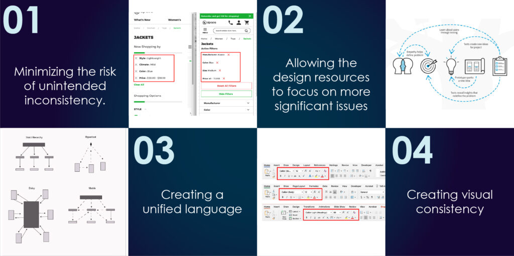
- It can replicate designs quickly and at scale
One of the primary benefits of a design system is its ability to replicate designs quickly and at scale by using pre-made UI elements and components. These elements can be reused again and again, thus reducing the need to re-create new elements. It also helps in minimizing the risk of unintended inconsistency.


- It alleviates the strain on design resources to focus on more significant issues
Reusable design elements and components allow the design resources to focus on more complex problems like workflow optimization and information prioritization. Although it may seem like a small thing, this factor comes in really handy when the workload increases across hundreds of screens.
- It creates a unified language
When design responsibilities shift or when the teams become geographically dispersed, it becomes extremely necessary to ensure that there is a unified language within and between cross-functional teams. This is where a design system comes in. It ensures that there is a unified language across the organization, thus ensuring reduced wasted designs and less wasted development time.


- It creates visual consistency
A well-implemented design system creates visual consistency across products, channels, and departments, whereas, its absence can lead to experiences that seem fragmented or unrelated. When teams are working in silos, each product or channel operates independently. Hence, a proper design system must be in place to provide a single source of styles, components, and patterns to unify these disjointed experiences.
Using a Design System Helps in
Elements of a Design System
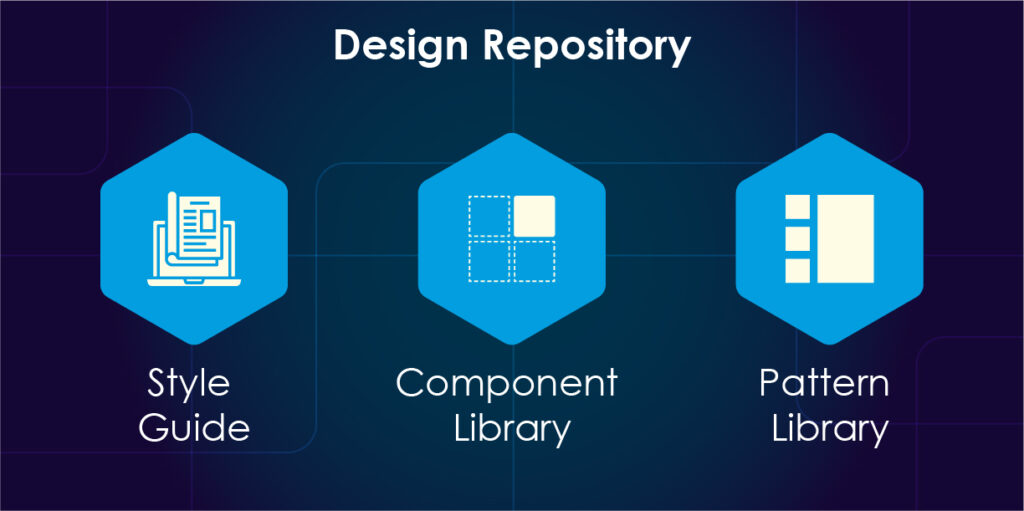
Design systems have many components, patterns, styles, and guidelines, which can help operationalize and optimize your design efforts. It has two essential parts- the design system repository and the people responsible for managing it.
Design Repository
Design system repositories can take various forms, but it usually consists of mainly three things- (i) style guide, (ii) component library, and (iii) pattern library.
Let us look at all of these in detail.
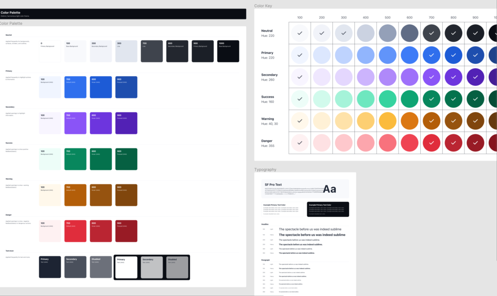
Style Guide
Style guides contain specific design principles, implementation guidelines, and visual references for creating interfaces or other design deliverables.
The most common style guides focus on branding (colors, typography, logos, trademarks, etc.), but style guides also offer guidance on content (such as language recommendations & tone of voice) and visual-&-interaction design standards too. To provide relevant guidance in context, these guidelines are sometimes incorporated into the component library as well.
Component Library
Component libraries or Design Libraries are thorough libraries that are packed with predetermined, reusable UI elements. These libraries serve as a ‘one-stop shop’ for developers and designers alike who wish to learn and implement these UI elements.
Component Libraries include component name, description, attributes, state, code snippets, and finally, Front-end & back-end frameworks to implement the library.
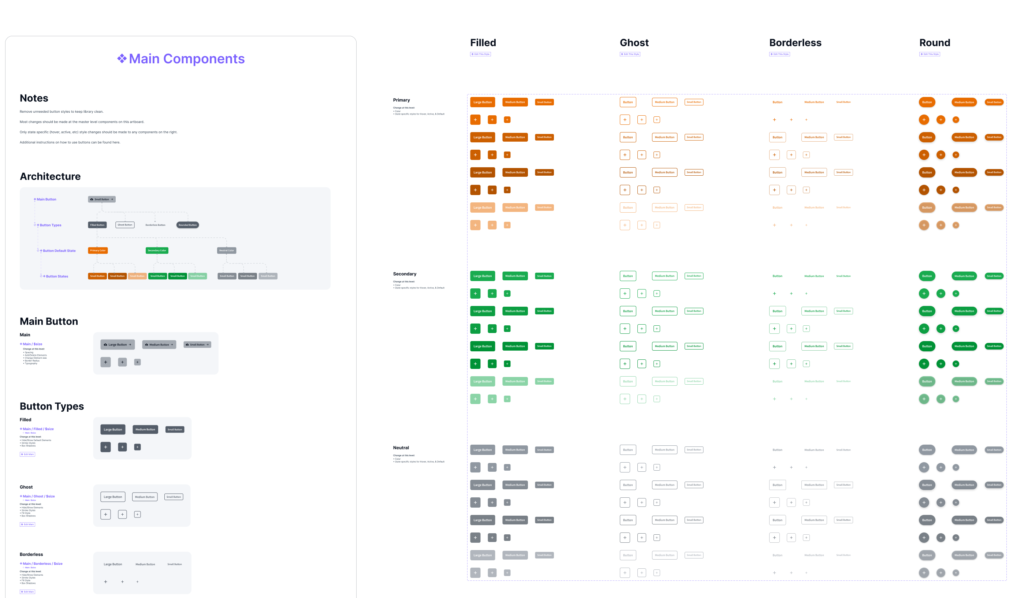
Pattern Library
The terms ‘Pattern Library’ and ‘Component Library’ are at times used synonymously; however, there is a distinction between the two.
Component Libraries specify individual UI elements, while Pattern Libraries feature collections of UI-element layouts or groupings.
Pattern libraries are often considered less robust than component libraries, but they can be as thorough or as high-level as needed. They typically feature layouts, content structures, and templates. The patterns, much like the components, are meant to be reused and adapted.
Top 5 Design Systems in the Market
1. Google (Material Design)
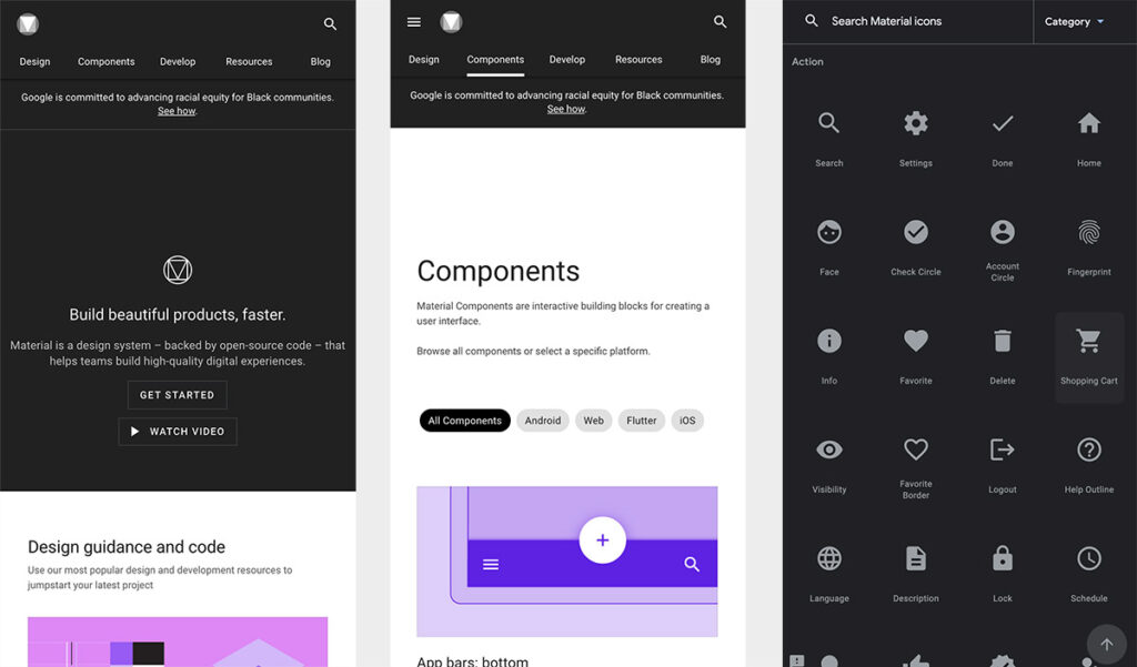
Founded in 2014, Material Design by Google is one of the most popular design systems today. Staying firm in its strategy, Google has been implementing Material Design in almost all its products consistently and effectively, exploring new components for its libraries and providing complete documentation of each one of them. Their exemplary use of atomic design has also served as a guide for thousands of UI designers.
Pros:
- A wide range of significant components
- Detailed design documentation and use cases
- Clean and minimalist design
- Provides styles needed to design in dark mode
Cons:
- Its popularity in Google products makes the adoption of Material Design take away the product’s brand identity
- If not used cleverly, the design components can result in a boring composition
- Prioritizes visual recognition (familiarity) by Android users
2. IBM (Carbon)
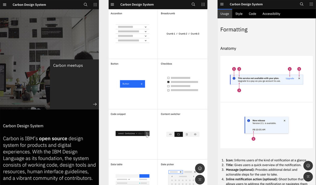
IBM’s design system, Carbon, is an open-source design system that goes over and beyond documenting the style guidelines. They share their philosophy and a gallery full of examples of their design system in action, establishing a shared vocabulary between designer and developer, and providing clear, discoverable guidance around design and development best practices.
Pros:
- Minimalist and Elegant
- Has extensive but orderly documentation
- Excellent use cases and examples
- Unerring information architecture
- Modular and flexible components
Cons:
- Works better for products suitable for corporate use
- Lacks visual cohesiveness
3. Microsoft (Fluent)
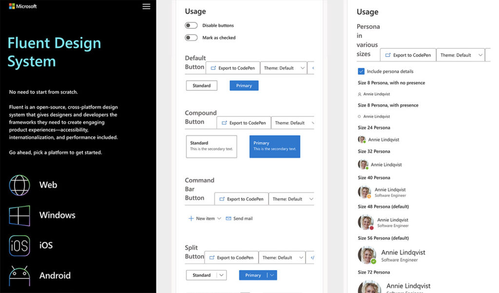
Microsoft developed the Fluent design system in 2017, achieving simplicity and consistency through open design systems for all platforms in many respects. Microsoft’s strategy focused on inclusion, bringing together customer needs and design fundamentals. It also provides guidelines for developing applications for iOS, Android, and Windows devices.
Pros:
- Has a dynamic way of presenting its libraries
- Has various toolkits for Sketch and Figma
- Addresses a large number of casuistry and components
- Provides complete cross-platform documentation
Cons:
- Lacks consistency in navigation between the libraries
- Design lacks clarity, sometimes without the necessary negative spaces
- Few layout distribution problems
4. Apple (Human Interface Guidelines)
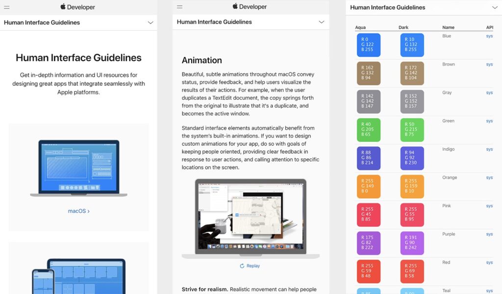
Apple’s Design System, Human Interface Guidelines, is one of the most well-known design systems. Using the design foundations of its Mac OS X operating system, Apple created this design system to provide a consistent experience across its products. These guidelines (Human Interface Guidelines) are frequently updated, adapting to new technologies, products, and environments.
Pros:
- Complete cross-device documentation.
- Good balance between usability and identity
- Detailed guidelines and use cases
- Minimalistic and clean design
Cons:
- Components and guides are focused on operating systems
- Documentation becomes very textual at times
- Doesn’t allow direct interaction with the component (just JPG screenshots)
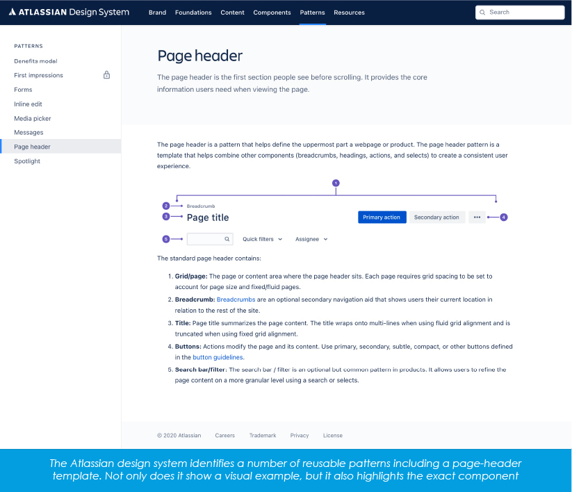
5. Atlassian
Atlassian, a software company, best known for Jira, is inspired by Apple’s Human Interface Guidelines. It has decided that its design system needs to be based on code while maintaining ease of use. Accessibility is the most critical factor for Atlassian’s design system, and their design adheres to standard contrast ratios that ensure users with low vision can see and use their products. All the foundations, components, and patterns are well-described on their landing page itself.
Pros:
- It contains 1000 add-ons and extensions
- It allows users to combine modules, software, and various third-party tools
- It helps to prioritize the principal works and increase the project’s productivity
- It allows the manager to track the project virtually from anywhere, anytime
Cons:
- File size (upload) can be increased
- Sometimes it is confusing to understand UI
- Reporting and charts can be improved to track burndown and velocity
What Design System Should You Use?
The only way to start building a proper design system (if you have a design team ready to spend enough time on it) is to follow the step list above. Suppose you would like to check real-life pattern libraries and find inspiration. In that case, you can check out – Website Style Guide Resources – a great resource bookmark that has examples from a wide variety of companies and private contributors that have put their style guides, pattern libraries, and open-source design systems online for the public. Different options are also available for those who don’t want to copy the existing style.
Designers worldwide create their own versions of design systems based on Atomic Design methodology that can be purchased online. You can pay for a license to use the customized library, patterns, and other components for individual and commercial purposes.
And the central – professional advice can always help you to make the right choice, review a current Design System, and even create a better one based on your requirements.
Final Note: How Can Worxwide Help You Choose the Right Design System and Implement it?
Did you know? You can save around $1.5M and over 20% of the time of all your teams — designers, developers, project managers, and others with the right Design System in place. Sounds interesting right?
We at Worxwide Consulting have a team of UI/UX design firm expert’s with vast experience in working with various design systems and even creating them. We can help you choose the right design system based on your business application. We can suggest the best possible design system for your business based on your pain points and further help you implement the said design system into your business. So, what are you waiting for?
Get in touch with our UI/UX design services experts today and start your journey towards the right design system for your business.

tx, USA

London, UK

India