

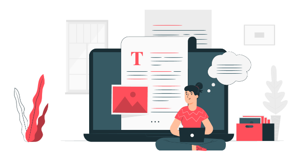


The client
An innovative Insurtech company, is diligently constructing a robust insurance ecosystem tailored to meet diverse needs. At its core lies an intricate insurance vault, meticulously designed to safeguard policies and facilitate seamless access. Complementing this is a suite of claim assistance services, aimed at guiding individuals through the often complex process with clarity and ease. Moreover, the company is committed to empowering its users with extensive documentation, providing invaluable insights into the nuances of insurance policies.

The problem
Currently, users face numerous hurdles in fully leveraging their insurance coverage, ranging from difficulty in accessing policy details to navigating complex claim procedures. This lack of transparency and accessibility often results in underutilization of insurance benefits and leaves individuals vulnerable to unforeseen risks. Furthermore, traditional methods of managing insurance policies fail to provide users with the necessary tools and resources to make informed decisions about their coverage. This leads to a significant gap in understanding among policyholders, hindering their ability to maximize the value of their insurance investments.

Long Documentation
- Lengthy documentation laden with technical jargon poses a barrier to understanding for average users.
- The complexity of the language used in documentation hinders users’ ability to make informed decisions about their insurance coverage

Insurance Claims
- Complex and convoluted processes for claiming insurance create frustration and delays for policyholders
- Lack of clarity and guidance during the claims process leads to confusion and potentially missed opportunities for coverage

Missed Renewal Dates
- Traditional methods of insurance renewal lack interactivity, increasing the users missing renewal dates.
- Non-interactive processes contribute to oversight and forgetfulness, potentially leaving users without coverage.
Biased Agents
- Agents prioritise commission over users’ insurance benefits
- Existing clients might receive insufficient attention
- Addressing bias ensures fair treatment and maximises insurance value
Awareness
- Users lack comprehensive knowledge about their insurance policies.
- Knowledge gaps hinder users’ understanding and utilization.
- Providing educational resources can empower users to make informed insurance decisions
The solution
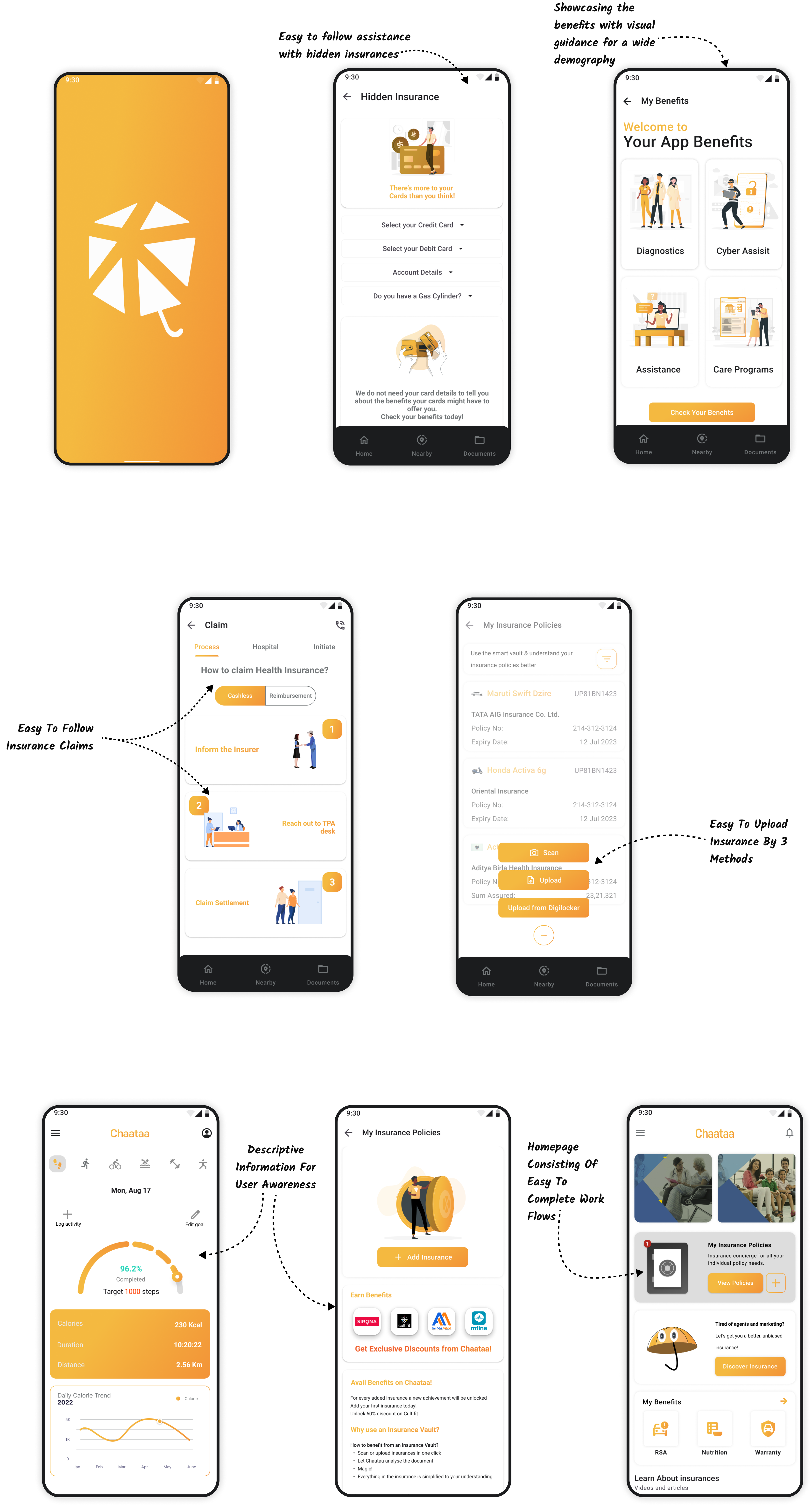
We solved the problem by creating a user-friendly mobile app to simplify interactions and provide easy access to crucial insurance-related information stored within the insurance vault. Users can effortlessly navigate their policies, access coverage details, and pertinent documentation anytime, anywhere. Additionally, interactive features promote engagement and community-building among users. This streamlined approach not only enhances user experience but also democratizes insurance access, empowering individuals to manage their financial security effectively.

Easy and Intuitive
Structured the portal into easy to understand workflows by breaking the portal and increasing visibility of task per module. Ideated a dynamic homepage which shows the most relevant tasks and modules for each user.

Navigation
We created an expanded version of the navigation that gives full control to the user by showing the required module name and a consistent iconography for better recall and all time access to navigation.

Responsive Design
Some tasks require the users to upload the images that are clicked on the site this is now facilitated by the responsive design of the portal. We kept the design on mobile phone, tablet and web the same for increased recall in user.
Notifications
We included notifications for each step after assigning of a task to the user. Once the task is assigned the user gets a notification, it repeats after sometime until it is executed and it shows prominently if the target date is close, or overdue.
Seamless Reports
The system now gives data dumps along with the raw data which can be filtered down to a single value in order to create reports for a specific level of hierarchy in user designation and organisational units.
Our work in action

Customer Engagement
Increased customer engagement time with immersive content like digital twins.

Ecosystem Effect
Increased customer acquisition rate with better online and virtual experiences, combined with in-person relationship building

Better Interaction
Nearly 50% of test users found the design highly interactive after redesign. Additionally, they could navigate the entire app without getting confused.
tx, USA

London, UK

India