


The client
A global provider of digital transformation solutions, delivered solutions in 20 countries in the fields of Predictive Analytics, Digital Experience and Digital Supply Chain Management. Driving innovation through outcome-based business models, proven and powerful IP solutions, trusted partner for over 1000+ customers, including Fortune 500 companies. With strong capabilities in Digital Technologies with over 4000 associates having technical and domain expertise, delivering solutions to the Oil & Gas, Telecom, Power, Government, Banking, Retail and SCM / Logistics verticals.

The problem
How might we reduce non-compliances digitally which is currently a tedious and time-consuming task for business users along with hard-to-understand terminology with multi-level hierarchy and sub modules.? How might we handle the error prevention in the system for handling wrong data input due to human error? How to provide personalized and holistic view in the platform to provide insights to the stakeholders for faster decision making?

Lengthy flows
- Users face a high learning curve due to complex and cluttered information architecture, resulting in lengthy and cumbersome workflows.
- The platform’s complexity hampers user efficiency and leads to frustration, impacting productivity and user satisfaction negatively.

Time taking
- The current process for registering risks is highly time-consuming, leading to delays and inefficiencies.
- Prolonged risk registration procedures hinder workflow efficiency and may result in missed opportunities for timely risk mitigation.

Lacks in personalization
- Users face challenges in analyzing compliance insights due to the absence of personalized features.
- The current system lacks adequate controls for users to customize their compliance analysis, leading to limited flexibility and effectiveness.
Lacks user interactions
- The interface fails to engage users effectively, lacking interactive elements such as motion, colors, and other engaging features.
- Less user interaction and visual appeal, the interface may lead to reduced user satisfaction and engagement.
The solution
Conducted several workshops with business users to understand the expectations and defined problems at granular level for each user persona to co ideate solutions using card sorting and paper prototypes with the business users and asked users to perform the risk management task to perform usability testing on new UX designs. Provided an improved platform with reduced cognitive load, enabled personalized content and interactive dashboards for faster decision making on compliances and reporting.

Personalization
- Redesigned complex workflows leveraging card sorting & information architecture.
- Simplified workflows to enhance efficiency and user experience across the platform

Holistic View
- Empathised with business users – conducted 50+ interviews with business users.
- Used interview findings to inform decision-making processes and ensure solutions were aligned with user requirements and expectations

Time to Task Length
- Reduced the number of steps required to complete tasks, enhancing overall interaction efficiency.
- Streamlined processes to minimize task completion time, resulting in a more user-friendly experience.

Intuitiveness
- Conducted usability testing, including behavioral tests and task flows, to optimize the platform’s intuitiveness.
- Utilized insights from usability testing to refine the platform’s design and improve user experience.
Our work in action
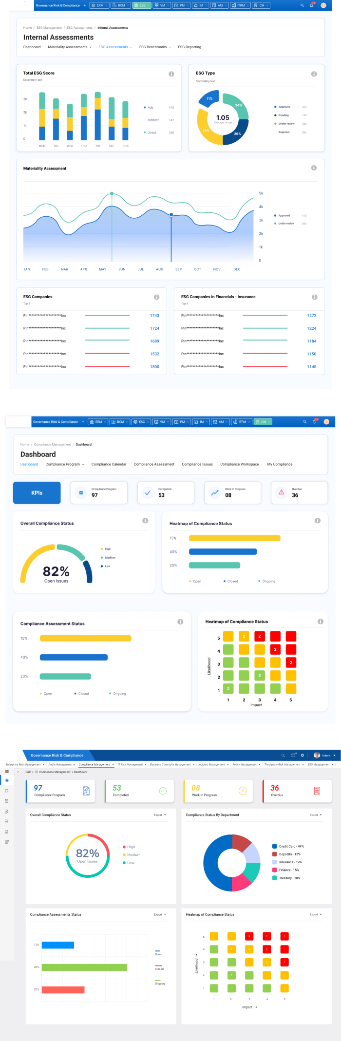
Seamless Experience
Reduced the number of steps by 66.7% (from 3 steps to 1) to record an incident, making the portal highly intuitive.
Time-to-Task
The new interface reduced the time to take action on incidents by two-thirds, from 15 minutes to 5 minutes
Faster Decision-making
Users receive customized dashboards tailored to their roles, enabling faster decision-making to meet specific needs.
tx, USA

London, UK

India